Artist Bio App For Local Art Gallery Case Study

Product Overview:
Art and artists are all around us. From online photos to in person galleries, art is everywhere. People are looking for entertainment but it is hard to follow their favorite artist or find where they will be displaying their art.
BeArt is an application geared towards all artists wanting to connect with other artists and local galleries. I am excited to be apart of this project that allows users to create a profile and showcase their art. Users can easily add their own art to their portfolio and find or follow their favorite artist. It also allows artists to find local art shows, galleries, and markets.
Problem:
One pain point is the lack of social planning, scheduling, and information for artists attending local art galleries and markets.
Another pain point is the lack of representation for smaller artists.
Opportunity:
Create a communal space where users (both artists and customers) can go to find date, time, and locations of local art shows, galleries, and markets. Also allow smaller artists to showcase their art, portfolios, and stay in communication with other artists and customers.
Action:
The actions that I took were user research, creating user flows, wireframes, prototyping, user testing, and responsive design to better understand the user’s pain points along with improving user experience.

Research:
My research consisted of a vast comparison around competition sites and applications. After running my competitive audit, some key findings were hidden artist bios, forgotten artists, and lack of information.
Artists bios often get suppressed under products, sales, events, etc. Art galleries or events with many artists tend to have a lack of opportunities to find, save, or remember great artists. And it is difficult to find information on the artist quickly, whether that be in person, online, or at the attending gallery.
Ideation:
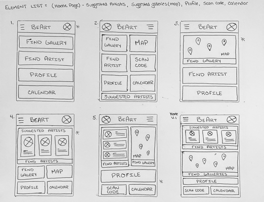
My thought process was to create a clean and organized application to allow users to quickly locate an artist or event to attend. I wanted there to be an intuitive home page for finding artists, galleries, and the user’s profile. I also wanted to showcase the user and their page containing a portfolio and personal bio. I came up with a few ideas and created a paper wireframe to play around with some of the elements and positions.
Design:
Low-fidelity wireframes
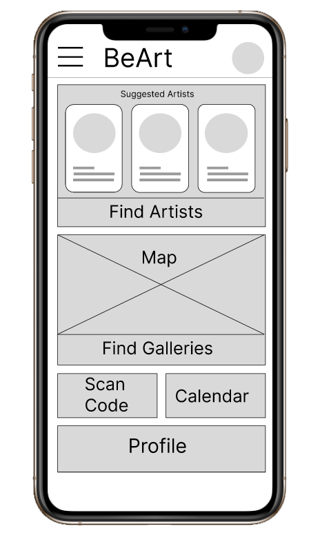
Designing the digital wireframe was highly influenced by the hand-drawn wireframes. I wanted the homepage simple enough for the artist and galleries to be easily accessed.
For the Artist profile page, I wanted the page to be centered around the artist. I wanted there to be a place for the artist to tell their story and a display for their artwork.

Design:
High-fidelity wireframes
From feedback received from the participants of the usability study, I added and changed the calendar page to include a confirmation page before adding events to the calendar.
I also added a button for finding artists on the home page to make it easier to search for artists.
Usability Testing:
I conducted two rounds of studies. The first round was on my low-fidelity wireframe and the second was on my high-fidelity wireframe. I had 5 participants of ages between 19 and 70 years old, mixed gender identities, and within the united states for both of these studies.
First Usability Results:
People found it super easy to find artists profiles and galleries
3 out of 4 people thought it would be nice to have a confirmation page when adding to their calendar
Second Usability Results:
Participants found the specific shade of purple to be too light and not dark enough for accessibility limits
Participants wanted a clear button for finding artists on home page
Participants found it super easy to find artists portfolios
Accessibility Considerations:
Another accessibility consideration was making the animations quick, simple, and having the option to turn off or down if preferred.
Other accessibility considerations that were taken into account was being able to zoom in on photos, text, or options to make it easier to view.
One of the accessibility considerations was the color palette. I used a darker purple to comply with the accessibility color standards.

Impact:
Being able to connect with art and artists you love has had a huge impact in many ways including and not limited to socially, economically, and psychologically.
What I learned:
I learned a lot during the whole duration of this project. I learned that accessibility is really important in making an application and resources for events. Not only does an application need to be user friendly and simple, but needs to be intuitive for a broad spectrum of people and disabilities. I also learned that privacy is very important to creating online profiles since users are putting personal projects and art online.

Next Steps:
The next steps I wish to take for this project would be to add the event or gallery profiles.
Another next step I wish to take would be to study more on accessibility. I want this application to be as accessible as possible in its finished product.
Another next step I wish to take would be to expand to other cities, businesses, and or events.